Somewhere between freelance and small studio. KARL.WORKS is an officeless practice, positioned as a streamlined response to a dynamic and ever-evolving world, where low overheads, independent flexibility and network scalability meet modern demands and constraints.
Process
Projects start with a clear objective: launch something new, improve conversion, refresh a brand, or bring more consistency across channels. Delivery is shaped around focused sprints that combine direction, design and execution. The goal is simple: Better creative output, with less complexity.
Offer
Retainers
In close collaboration with you and your internal team, working a set number of days per week over an extended period, where the length varies according to needs and deliverables.
Projects
One project at a time with a fixed total cost based on deliverables. The project is planned, estimated, and deliverables specified before the project starts up.
Location
Currently based on the Isle of Man 🇮🇲, working across the islands, the UK and beyond.
Services
Creative direction, concept development, campaign design, visual identity, digital design, motion design, creative code, copy, content systems, social content and generative design.
Clients
Air CanadaAmnestyArsenal FCAFLBang & OlufsenBPBritish AirwaysBritish ArmyButlin’sCadburyCarlingDanske BankDFDSETM GroupFordFord MoneyHakkasanHondaHSBCIneosJaguar Land RoverKleinwort HambrosM&SMazdaMercedes-BenzPandoraPumaRadissonSchweppesSonyTelstraTim HortonsVodafone
Air CanadaAmnestyArsenal FCAFLBang & OlufsenBPBritish AirwaysBritish ArmyButlin’sCadburyCarlingDanske BankDFDSETM GroupFordFord MoneyHakkasanHondaHSBCIneosJaguar Land RoverKleinwort HambrosM&SMazdaMercedes-BenzPandoraPumaRadissonSchweppesSonyTelstraTim HortonsVodafone
Vodafone — DRM
Vodafone’s customer comms needed a flexible visual approach that could carry multiple campaigns at scale while still feeling brand-led, crafted and engaging. With TMW, I worked across art direction, design and motion design to concept, design and build email headers for Vodafone’s DRM campaigns, creating a system that could adapt across different messages, audiences and promotional moments. The work focused on turning everyday customer rewards and updates into visually distinctive campaign assets, using bold compositions, characterful motion and Vodafone’s established brand language to add energy at the top of each email. The result was a scalable set of email header concepts and executions that helped make high-volume customer communications feel more considered, consistent and visually engaging.
Uber Eats — Digital OOH Campaign
In collaboration with Special Group, I worked across art direction, design and motion on a digital OOH campaign for Uber Eats’ first media placements across several US college stadiums. The campaign promoted tailored student offers in a high-energy live sports environment, where the work needed to feel immediate, legible and unmistakably Uber Eats. A key challenge was the use of Uber green, which risked being confused with individual team colours, so the visual system had to balance brand recognition with compliance and venue context. The result was a suite of minimal, sharp looping digital executions, with selected assets dynamically responding to in-game moments to create timely, contextual interactions with the crowd.
ReFrame 🇶🇦 — Exhibition Identity
ReFrame brought together pioneering and emerging Qatari artists in Doha, spanning painting, abstraction and visual experimentation. Working with Luke Halls, I designed the exhibition identity, logo and editorial publication, creating a flexible visual system that could hold a wide range of artistic voices without flattening their individuality. The identity was built around the idea of framing: giving each artist’s work and narrative space to lead, while using typography, editorial pacing and layout to create cohesion across the programme. Extending naturally into motion and spatial contexts, the result was a contemporary cultural framework that connected artists, audiences and disciplines, positioning ReFrame as a platform for dialogue between heritage and contemporary expression in Qatar.
NSPCC — A Safer Way to Play
Online safety is often framed through fear, but NSPCC’s Game Safe Festival needed to speak to gaming culture with more optimism, energy and care. With Open Creates, I worked across design and motion on the launch film for A Safer Way to Play, helping introduce safeguarding in a way that protected the joy, creativity and connection children find through play. The visual language was motion-led and immersive, using pace, colour and energy to carry messages of protection without making the film feel instructional or overly cautious. The result positioned online safety as something that supports play rather than limits it, reframing safeguarding as a shared responsibility across parents, platforms and communities.
Amnesty — Rights in Older Age
For Amnesty International’s Rights in Older Age campaign with Distillery, I worked across art direction, identity and motion to help launch Age Loud, a global campaign advocating for a UN convention to protect the rights of older people. The challenge was to move away from narratives of decline and vulnerability, reframing ageing as active resistance and making older voices impossible to ignore. We created a bold, adaptable identity and multilingual logo system designed to work across borders and cultures, supported by a showreel that centred lived experience over pity. The result positioned older people as visible, vocal human rights defenders, uniting them under a clear global call to action.
Arsenal FC — Supporter Banners
For Arsenal FC’s Supporter Banners project, delivered directly with the club, I designed and produced over 150 banners and flags representing official supporter groups worldwide. Each piece was individually crafted, drawing on historic football iconography, colour and form, then photographed by hand to capture the movement and texture of real fabric. The result was a unified stadium-wide visual system that honoured Arsenal’s global supporter base while feeling bold, authentic and supporter-led inside the Emirates.
BIP.credit — Cardless Credit
For BIP.credit with DentsuX, I worked across design, motion and social to help launch the world’s first cardless credit app. The challenge was to translate a sharply defined brand identity into social-first communications that could introduce a new financial behaviour without adding complexity, friction or visual noise. Working within a deliberately restrained visual system, we developed a campaign centred on reduction and focus, using minimal compositions, disciplined motion and high-contrast colour to reinforce the direct relationship between user and product. The result was a distinctive and ownable social presence that reflected the simplicity of the service itself, communicating confidence through clarity rather than explanation.
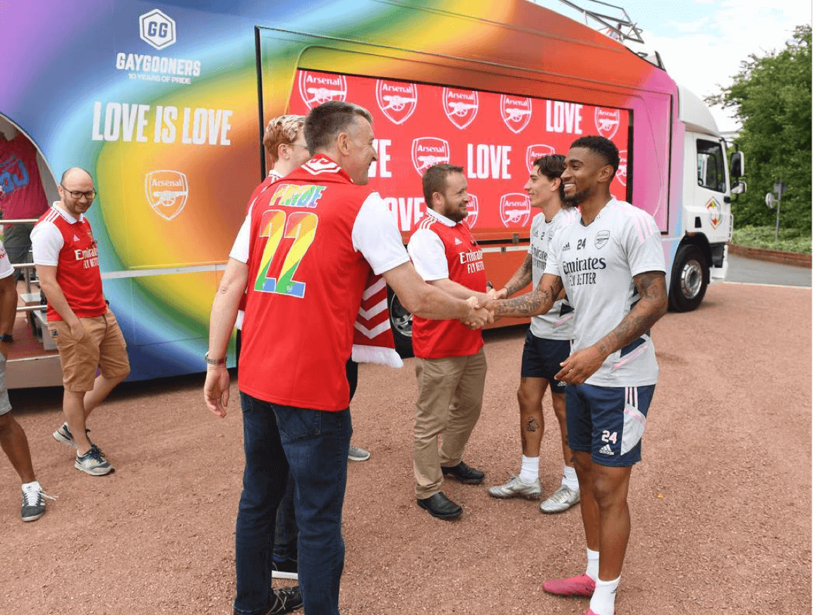
Arsenal FC — Pride
Working directly with Arsenal FC, I designed and produced a collection of 187 banners and flags representing more than 150 official supporter groups across the world. The challenge was to create a unified visual language that could celebrate the diversity of Arsenal’s global fanbase while remaining unmistakably Arsenal — authentic enough to feel supporter-led, yet bold enough to command space throughout the Emirates Stadium. Drawing on historic football iconography, colour and form, each banner was individually crafted and photographed by hand to capture the movement and texture of real fabric. The result was a stadium-wide visual identity that balanced global belonging with local pride, transforming thousands of individual supporter voices into a collective expression of the club.
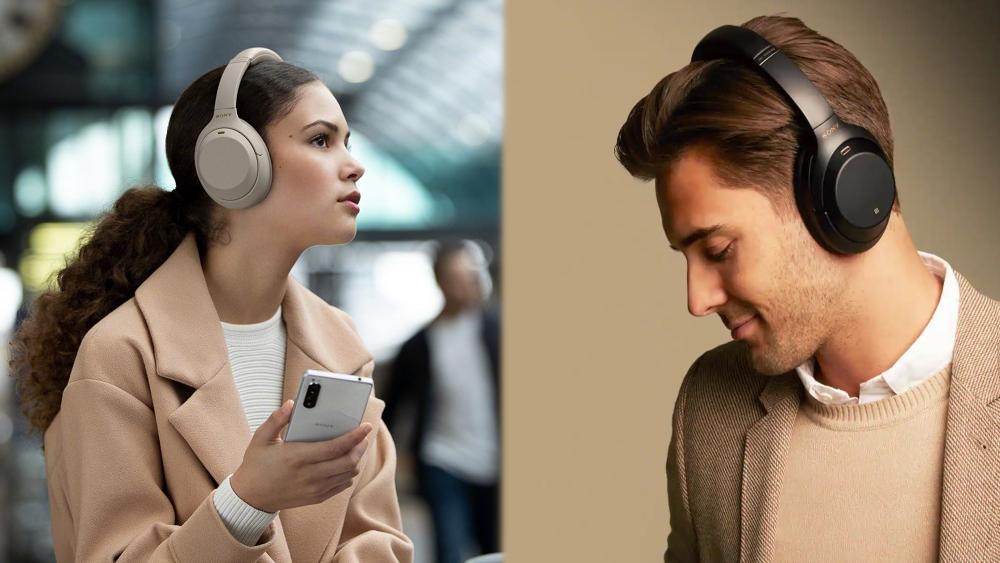
Sony — WH-1000XM4
Sony’s WH-1000XM4 launch needed to move from a polished global campaign into fast-moving social environments across Europe, without losing the clarity or authority of the hero work. With DentsuX, I worked across art direction, design and motion to build a modular asset system from the TV campaign, adapting it across platforms, formats and languages. Short-form edits, motion-led layouts and localisation frameworks helped key product benefits — from noise cancellation to battery life — land clearly in each market. The result was a cohesive rollout that kept the campaign consistent, flexible and recognisably Sony across every execution.
Fortell.ai — AI Character Identity
For Fortell.ai, I worked across art direction, design, identity, product and motion to develop a brand identity for an AI character designed to communicate across different languages, cultures and social contexts. The challenge was to create a visual system that could feel intelligent and technologically progressive, while remaining approachable, inclusive and easy to understand for underprivileged communities seeking support around medical and societal questions. Centred on the idea of two overlapping speech bubbles, the identity used a simple visual metaphor for transparent, collaborative exchange between the avatar and its users. The result was a clean, modern and accessible brand world that reflected the character’s purpose: enabling clearer communication, building trust across diverse audiences and making complex support feel more human.
Ineos — Cardless Credit
Before the Ineos Grenadier physically existed, it needed a world people could believe in. At Grey, I worked across art direction, design and motion to help shape the social launch for INEOS’s purpose-built off-road utility vehicle, translating renders, sketches and strategic intent into a bold visual language. The campaign built around a no-nonsense identity system: functional layouts, robust messaging and a stripped-back brand world that reflected the vehicle’s tough, utilitarian positioning. The result helped establish early momentum around the Grenadier, giving shape to the promise of a new kind of modern off-road utility vehicle.
Nokia — No Time To Die, 3310 Launch
For Nokia with Grey, I worked across art direction, identity, design, motion and social to support the relaunch of the iconic Nokia 3310 alongside the release of No Time To Die. Following pandemic-related delays that disrupted the original campaign rollout, the challenge was to reintroduce a cultural icon in a way that felt relevant to a contemporary audience while aligning it with the world of Bond. We developed a live, social-first mini-series following Nomi’s mission as it unfolded across four global cities, blending newly captured footage with curated content to create a real-time narrative experience. Rather than focusing on product specifications, the Nokia 3310 was woven naturally into the story as a symbol of resilience and reliability. The result was a launch that connected nostalgia with contemporary storytelling, bringing one of the world’s most recognisable phones back into culture at the pace of social.